When demonstrating a design, whether it is a product or an advert, you, as a designer, must consider your targeted audience. Incorporating appropriate tone of voice can influence the end result dramatically, this can be soft and delicate, targeting women and babies or strong and masculine, targeting a male audience. Context used can also demonstrate and refer to a specific time era. These key principles are extremely crucial aspects when considering any design.
Advertising
Advertising is about alluring your targeted audience which is achieved by creating an appealing, eye catching, captivated design. You can't force anyone to be interested in a design, this is achieved by persuasion. Applying appropriate context for your targeted audience depicts how an advert is to be presented.
Milton Glasser- I ♥ NY
 |
I Love New York en.wikipedia.org |
This design demonstrates a simple typewritten font with a bright red love heart. This semantics (shape of love heart and phrase, I Love New York) symbol is created by Milton Glasser, illustrating an abstract design to the audience. This piece of design was used throughout New York to generate interest and persuade the people to come and visit, bringing back love for the city. Glassers famous symbol is now a commercial design used in numerous advertisements, whether it be for New York itself, or alternative designs with the same principle ( I HEART 'love' PIES). This famous design/layout has been illustrated repetitively worldwide, creating effective advertising. Milton's design is recognised worldwide and this design has made New York as famous as ever, generating a unique design for New York. The 'New York' design printed t-shirts promotes 'love' ( spread the word), which has completely worked. Today, the design is still strong and recognisable, even after 30 years, demonstrating when people read this message they will always reflect on their love for the city, very psychological.
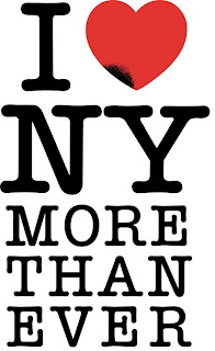 |
I love New York more than ever, design by Milton Glaser wallflowerdispatches.com |
This is an exact replica of the original masterpiece, however with a unique twist. Being designed in an identical manner allows people to relate to the design. The new version encourages the public to love NY more than ever! The reasoning behind this is, after the tragic event of 9/11, trust in the city is required in order to reassure the world New York is tough! The black smudge on the heart symbol demonstrates Manhattan, the city where the Twin Towers were destroyed and recognising the people who lost their lives.This design was aimed for people who lost their trust in the City, who doubted it because of the terrorist attack. The context is designed in the same way as the original design to enable it to be an instant worldwide, recognisable design, which is extremely strong and powerful.

No comments:
Post a Comment