Thursday 29 March 2012

Studium/Punctum

Within photography there are many meaningful messages. The theory "Studium", meaning something cultural, that is fascinating and "Punctum", referring to what is prominent from the image.  The principal piece of the design draws the viewers attention to make them stop and think. Many photos have a story that is shocking or bizarre. This is dependant on what the viewer perceives and how they de-code the story.  This is achieved by pin-pointing the de-coding and identifying the message occurrring, etc.

Diane Arbus

Diane Arbus - A young man in curlers at
 home on West 20th Street, ...
trans.ilga.org
Here the photographer Diane Arbus takes a photo of a very "UNATTRACTIVE" transvestite, having strong bone features and a long face instantly draws your attention as the viewer. This photo would  attract instant attention for this time period which is most likely to be the 1960s- 80s evidenced by the type of rollers in the mans hair. The story is of a man openly happy to have his photo taken, portrayed by how he is posing,with a fag hanging from his fingers. This bizarre, unconventional photo attracts the viewers attention with its eccentric, unattractive image.


Diane Arbus
thecesarsalad.blogspot.com
A elderly, middle-class couple overwhelmed at the sight of a giant in their own living room. The main Punctum would be, how come there is a large man standing in an old couples home?. The couple are both presented as very respectable and clean cut. The giant is quite opposite, scruffily dressed. This helps makes him instantly noticeable to the audience. Normally in the 1950s  such large people were rarely heard of and would be considered as a 'Freak'. Here, Arbus demonstrates Punctum in a humorous scene, whereas Studium would be demonstrated with a charming scene of an elderly couple in their own home greeted by a BFG.


Vernacular Typography

In the Design world many artists exercise their own personal style ( signature) to make their work unique and prominent from the rest. With a unique personal design, your work is remembered which helps to get you noticed and generate interest in you. In today's society  it is extremely competitive and difficult to get your name noticed.  If you have creative, distinctive art work, this would attract the right attention and help the designer further their creative future.

SO-ME

The creation of Parisian electronic masterminds
Gaspard Auge and
 Xavier de ...
thecoolhunter.net
This video demonstrates the artist " SO-ME" with continuous t-shirt changes of funky illustrations which are animated. These cool images are in a similar format and help to promote the artist's work. Very unusual and unique! SO-ME distributes their work in a signature format, with cheerful, charming imagery, helping to promote the artist's name and become the talk of the design world. Being so unique, the designs work well with the music, helping to make the band 'Justice' in with the crowd. Being able to create an exclusive style will help the designer get more noticed and promote both artist and the band.


0daysound.blogspot.com
600 × 623 -
Kanye West ft T-Pain - Good Life

Kayne West, another artist singer gets influenced by SO-ME, as it is the new 'IN' thing. This illustrates the importance of how signatures of a certain style of work is so important and can helps promote your work. For this example the designer 'SO-ME' has achieved their certain style with other artists. You can see in these images how the designer has used the same style of work as in 'Justice' video, achieving the signature. However, it has some differentiation, but is not obviously different.

Cultural Communication

In today's society many countries communicate in a variety and bizarre ways, reflecting how they live. Old traditional messages like Egyptian hieroglyphics, communicate stories through drawings from scenes of great victories to 21st century modern text messages. Typography differs in different cultures, enabling each Country to portray their own unique culture. In today's 21st Century, the world communicates principally over the Internet, with different designers all over the world presenting diverse ideas inspired by their cultural surroundings.
... algorithms and models to (partially)
automate design processes.
shapeshifters.be


Andréas Uebele

Uebele distributes typography in a ultra-modern format. Here, this German designer places the text  above the public head. The design is extremely eye catching and captivating to the audience with its big black typography being displayed in an unusual place. It is prominent as it is clearly visible from the white walls and ceiling. The typography on the ceiling demonstrates a helpful guide with directional arrows, promoting room locations; helping save space in this thin corridor. The Designer has successfully achieved designing a unique method for achieving his objective of illustrating typography within a limited area and presenting it in German. This modern German design is different from other formats, communicating to the public in an unusual way but also being informative.


Special Recognition For

Typographic Excellence

Masayuki Terashima,
Ikenobo Sapporo Exhibition


Masayuki Terashima


This Japanese design illustrates traditional typography of the Asian culture. However, here there is a twist in presenting the design with a origami illusion. This design is extremely unusual and generates interest, especially among other countries. The design captures the beauty of Japanese traditional handwriting, blended with a leaf impression which is native to the country. It works well with the mint green background, capturing the interest of the audience with the unique, simple, yet appealing design.

Activist Artists

For many years people have used activism to try and change/ direct changes whether it be political, for the environment, etc. Activist Artists however use their talent skills to promote their beliefs through design, making the message more powerful. This could be used in the media, advertisement, ambient, etc to help protest their cause to others and spread the message in more interesting and eye catching formats.

Adrian Piper

Adrian Piper, Catalysis III, 1970.
Adrian Piper, "Catalysis III," 1970
blog.art21.org
 Adrian Piper demonstrates black rights in the 70s when racial times where difficult for the black community. Adrian's political messages are illustrating visibility and comparing black with white in a abstract manner. Adrian stands in a white jumper in a busy high street with the words ' wet paint' written in black which is prominent on the white jumper. People passing by clearly see her as she is unique and stands out from the rest, making her the focal point of the street. This activism protest is different,and bizarre but generates the required effect as it gather a lot of attention. Passers by would spread the word of what they had encountered on their way through the busy high street. The best type of publicity stunt is viral (WORD OF MOUTH).


Jenny Holzer - Biography & Art - The Art
 History Archive
arthistoryarchive.com


Jenny Holzer

This design distributes a message on a billboard, above a busy road and being presented prominently in bright lights. Here, Holzer is using  techniques that are commonly used for advertisement but replacing it with a statement. This illustrates how not everything on billboards is about selling merchandises. The phrase she has used ' PROTECT ME FROM WHAT I WANT' is in capital letters, making it blatantly eye catching to the public, again being viral. This is a clever activist piece, carefully portraying how she uses words and presents them with greater power, getting to the point! Also questioning the public, making them question themselves.

DDB

Over time, designs have been made to look packed, vibrant and 'Tacky'. This was typically used in advertisements aspiring to sell the product, e.g a swanky car by the beach with exotic girls in bikinis. This is completely consistent with other designs of the 1950s. However Artist, Helmut Krone, transformed design by cleverly producing a design so simple and plain, yet extremely effective This was one of the first creative designs to be made. Krone worked around the idea of the Volkswagen being a small, German car. This idea was a great advantage to Krone as it enabled him to devise famous pieces of work, steering away from the cluttered 'BUY THIS' style of work to skillful, abstract pieces which attract audiences thinking.

Craig Holden Vs Hitler

http://constitutionalistnc.trip/
od.com/hitler-leftist/id1.html
This campaign was used during the war in Germany (1933-45). Hitler loathed the idea of tobacco and felt strongly about this, evidenced by this cartoon humorous style image being pertinent and obvious. This poster illustrates a giant German boot kicking a cigarette and cigar out of the door, with the Nazi symbol visible and demonstrates a clear political campaign against tobacco. This was one of the first campaigns against smoking, However, this design did not get the desired attention.  This poster portrayed a humorous side, rather than concentrating on the serious aspect of  health risks.


BEGSON
begson.com


Craig Holden demonstrates his smoking campaign in a gruesome way, spoon feeding cigarette stub ends to the girl. This exaggerated image generates disgust.  It emphasises what  smoker are actually doing to themselves and also the possible thoughts of a non smoker. Holden is applying an abstract approach in how he portrays the non smoking campaign, without using the typical icon of a cigarette in a red circle. This design illustrates a pile of cigarettes, with a bit of ash on the girl's lip, demonstrating the amount of cigarettes consumed without people probably realising it.Comparing both the above campaign and Holden's, both are created in an abstract way, however, the German design does not disclose anything to suggest the diverse side effects, whereas Holden clearly illustrates the gruesome reality of smoking.

Simplicity

When creating a design, simplicity is the key aspect that makes the work more understandable (as long as the work has a meaning to it). To create a unique design, the design must have something interesting. In order for the design to be noticeable, it needs to be simple to allow the audience to recognise it. The best designs are the interesting ones that are abstract and simple, generating crucial initial interest.

This version by Helmut Krone
 and Bob Levenson.
adliterate.com
Helmut Krone

Here Krone portrays a miniature Volkswagon car, extremely reducing the car's size in the poster. Conventional car adverts would advertise a car, accompanied by glamorous half naked women on a California beach, in an exotic way. Krone's design was unique, a style never previously seen,  Using very limited space and choice of  the right text make this design strong and prominent, rather than a cluttered design. When creating a design you have to state true facts. This design is 100% accurate and appealing. The heading is abstract and humorous which immediately captures the audiences full attention.


Juan Cabral

Gorilla Woah Lord! Debuting on UK TV
 tonight, a new spot for Cadbury's Dairy ...
creativereview.co.uk
Cabral gets rid of the chocolate water falls and uses a different technique to cleverly capture the audiences attention. He simplifies the situation and creates a psychological aspect of how chocolate makes you feel! The gorilla bangs on the drums, showing his excitement (comparing to the buzz chocolate can generate). This image is extremely powerful and distinctive which is striking and captures the audiences attention. The image is completely random but also humorous. The audiences' initial reaction is shock, but reality soon materialises and the public recognises the gorilla is not real.  Cabral is being truthful with his image, just teasing with the audiences imagination. He uses the renowned Cadbury colours in the short film, capturing the famous established Company values.


Information Design

Information Design focuses on  high level information problems to provide understanding and transparency. The designer evaluates problems and encourages research to increase information understanding.  Considering how people respond to information provided will generate the best results. Effective information design gives a clear message to your audience.  Information must be communicated effectively in order to  have value and typical intended designs include:-  
  • Menu
  • Recipe
  • Timetable
  • Shopping Centre map
  • Bill
  • Holiday Brochure
  • Instruction Manuel
  • Packing Information
  • Health Information, etc.
This method of design visually assists your audience, helping them to understand the product with more than just pictures. This method is achieved with the use of clear text to meet specific designs, which is very crucial if you wish to acquire the desired effect. Obviously, design imagery is also a key point and it is important to provide clear information, easy for the viewer to understand and provide a clear overall image of what the designer is illustrating.


Typography
Typography is the use of words and numbers designed specifically for an intended audience. Typefaces and fonts are used effectively to generate legible communication.  It is imperative for a Designer to use the correct, effective typography in all designs.  If this is not achieved, information provided may not be clear and this could be a disaster, especially when designing information guides, leaflets, etc.  Typefaces effect Tone of Voice which effects the message being portrayed, whether it be serious, informative etc. It is imperative a Designer correctly achieves correct Tone of Voice in order to produce appropriate typography and convey an effect message across to the audience.


Neville Brody                                                                                
He did many works about Saul Bass
(he's graphic designer too).
larausluer.wordpress.com
When Designing the correct text for your chosen audience, you need to consider how it is going to be portrayed, the message you are trying to give and ensure that legibility is perfect for the chosen subject. Here, this design 'SAUL BASS' appears like cut-outs, with the illusion of silhouette men in different boxes. Brody designed this in Bass's style, establishing how powerful the design is, with the funky typography in the design it establishes a surreal impression. When creating a informational design the typography is important, so in this design the style is unique to the audience and is clear to read.


Visual Hierarchy
Is communicating your ideas effectively, breaking down and distributing information in order to display important aspects of your design. This information needs to be eye-catching towards the audience and attract appropriate attention to desired areas. The  illustration opposite is communicating important health information. The key headings and bold text are particularly visible and could be seen as visual hierarchy.


                          David Carson
This piece of designs visual hierarchy is strong, merging typography with the background image. Very unique, the design captures the audiences attention with its distinct layout! The type is repetitive, to ensure the viewer gets the message and the  white typography overpowers the dull/dark background. The design itself displaying "DO NOT BE SATISFIED" establishes interest and generates a question, what does this mean? This design creates the impression the man in the image is also considering this.


Tuesday 13 March 2012

Audience and Context

When demonstrating a design, whether it is a product or an advert, you, as a designer, must  consider your targeted audience. Incorporating appropriate tone of voice can influence the end result dramatically, this can be soft and delicate, targeting women and babies or strong and masculine, targeting a male audience. Context used can also demonstrate and refer to a specific time era. These key principles are extremely crucial aspects when considering any design.

Advertising
Advertising is about alluring your targeted audience which is achieved by creating an appealing, eye catching, captivated design. You can't force anyone to be interested in a design, this is achieved by persuasion. Applying appropriate context for your targeted audience depicts how an advert is to be presented.

Milton Glasser- I ♥ NY
I Love New York
en.wikipedia.org
This design demonstrates a simple typewritten font with a bright red love heart. This semantics (shape of love heart and phrase, I Love New York) symbol is created by Milton Glasser, illustrating an abstract design to the audience. This piece of design was used throughout New York to generate interest and persuade the people to come and visit, bringing back love for the city. Glassers famous symbol is now a commercial design used in numerous advertisements, whether it be for New York itself, or alternative designs with the same principle ( I HEART 'love' PIES). This famous design/layout has been illustrated repetitively worldwide, creating effective advertising. Milton's design is recognised worldwide and this design has made New York as famous as ever, generating a unique design for New York. The 'New York' design printed t-shirts promotes 'love' ( spread the word), which has completely worked. Today, the design is still strong and recognisable, even after 30 years, demonstrating when people read this message they will always reflect on their love for the city, very psychological.


I love New York more than ever,
design by Milton Glaser
wallflowerdispatches.com
This is an exact replica of the original masterpiece, however with a unique twist. Being designed in an identical manner allows people to relate to the design. The new version encourages the public to love NY more than ever! The reasoning behind this is, after the tragic event of 9/11, trust in the city is required in order to reassure the world New York is tough! The black smudge on the heart symbol demonstrates Manhattan, the city where the Twin Towers were destroyed and recognising the people who lost their lives.This design was aimed for people who lost their trust in the City, who doubted it because of the terrorist attack. The context is designed in the same way as the original design to enable it to be an  instant worldwide, recognisable design, which is extremely strong and powerful.

Sunday 4 December 2011

concept

Concept in how photography is portrayed. Being a hidden message or a clear story is what makes the imagery a success, especially photos that are eye catching/interesting rather than typical family shots. This principle of a message within the photography would be trying to decode the message within the image, whether it is extremely simple or full of imagery which is what makes the photo interesting to the audience. This would be for the imagery to come across to people what the message it is trying to say within the photo of the person, place, thing, etc.


Here is my photo of a barred green door. This scene illustrates a mysterious closed door locked away from the world with hidden secrets. The image portrays to the audience a message of a strange coloured door, making it eye catching to the public but why is it still a mystery? What does it hold in side? Who has been there? What history does it posses? So many messages in this photo which generates suspense and questioning its purpose of being not just a door, but a door with a story, rather than just letting people, why is that door so different to any other door? That's why this imagery has a great meaning to it, making the audience interested. With this principle in photography used makes the audience question about the imagery, letting their imagination go wild with so many thoughts, a bit like a detective decoding the scene of the crime. This style of photography produces a interest and making the photo more than just a image, but a creative story.

Allow me to weave you a tale on the
subject. Not the house of your ...
granitetransformations.com


This is whats great about creating a message within the photo, to generate suspense. Here the image of a worn out house, dull, empty, dead. What secrets does it hold? why is it abandoned? That's what helps generates a mystery to every photo and whether it is making the audience give sympathy or portraying humour all photos have a meaning to, a purpose to be noticed by the photographer. So eye catching to them they want the audience to see what they saw, experienced, came across when walking.


Messages in photography is when the photographer places either text in the image or edits the photo to allow words to be seen in a abstract way. This is either to make the photo more easier to understand or just to to make the photo unique to the audience. It helps bring the photo to be read from the photographers personal view, notes or what the person, thing in the photo is saying, thinking, etc. This photography would help the audience have a better understanding, whether it is for a humorous purpose,abstract, scary, etc. Its whether the photography feels it needs some kind of message in the photo to help classify what is happening.


Great Moments in Photography: Jim Goldberg.
Shown is “Untitled”, 1981, ...
matthewlangley.com
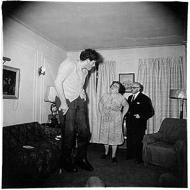
JIM GOLDBERG-
This message is obviously written on the photo, with personal hand written text. In this image the characters in the photo have expressed themselves towards each other. At the bottom of the page is the woman's writing, you can tell its her hand writing by how soft, delicate it is with the joint words. However the writing at the top is all scruffy, messy and is obviously the mans hand writing. Both talking about each other in this photography and what they felt. This is whats is great about having a personal message from the characters in the photo. Giving a insight in the meaning of the photo. With this simple effect gives the audience a clear message of the meaning of the photo and its purpose.


Wendy Ewald / Towards a Promised Land · Previous ·
Next; Portraits – Image 5 ...
artangel.org.uk


WENDY EWALD-
This example illustrates a little boy who's face expression portrays sad, lonely, with the boy looking directly at the audience, as if the message is directly to you. The message the photographer has used is over his head, text around. The message is hand written which gives that personal touch ' I didn't believe it- me, in Europe? No, its not me!. Illustrating how his birth place was so terrible his wish was to live in safety. This is demonstrated by the text, with that his wish is to live in peace and free from danger. This image is striking towards the audience, grasping their attention.

Friday 2 December 2011

Design workflow / From Novice to Expert

Design workflow focuses on the design process and improving your work/designs throughout a project to help improve productivity which is essential for any business. Workflow is a good source to identify how well a design is coming together, or if any changes need to be made. Being able to assess work in progress and in stages can eliminate expensive mistakes and optimise time effectively. As an example, I would utilise this process for my L4 visual communications work, based on my RVJ. In my project I would record in stages, commencing with the key principles, research, influence, thumbnails, experiments and then the final piece.  This process would allow me to work through a sequence of stages to ensure I work logically and efficiently to produce a cost effective manageable design.


This is an example of a workflow I created,                                     
breaking down the various stages of the work before
arriving at my final design.
Producing a workflow demonstrates how you can
move through various stages of design effectively
with logic in order to gain the desired finish. With a workflow, you can reuse your personal system that you feel comfortable with, in all projects you are given in order to achieve the design in the right manner. With this same principle to producing a design, you can look through what stages need to be done, for example research, you can then pin point what research is required in the project.
.


Web Design -
workflow diagram
innova-techsolutions.com


This design workflow professionally demonstrates how a well thought out plan can competently follow through and maximise time. The workflow commences with quotes, proposals and estimates. The chart proceeds to illustrate how the design is processed and various stages the design goes though before completing the design brief the customer requires. A variety of individual boxes have been created to allow the designer to assign various stages appropriately, thus making the work more manageable Having everything in order makes life easier for the designer.  This process can be applied to all design projects to produce a competitive, manageable design.


From Novice to expert is a terminology reflecting a person who knows very little 'novice', and learns things from a source, book, internet, learning very limited resources. Where the 'expert' is fully knowledgeable, having gained tremendous  experience through a length of time. Information found in books is where an expert has already investigated and actually experienced the situations. However the novice just learns the basics. The expert needs to have a real good understanding whether it means going to a specific location, seeing that object in the flesh, feeling, experiencing that moment which you read about in books. Hands on knowledge is the only way to genuinely achieve the research you are looking for, and achieve the required results. Exploring gives you a better understanding than just researching through books, like a novice. Were the expert is getting involved with that experience.


Frontispiece of the earliest dated
printed book, the Diamond Sutra, ...
rightreading.com
The Diamond of Sutra was printed in 868 AD which is one of the oldest books ever discovered, being printed by using wooden blocks and silk screens and being one of the earliest ever woodblock fragments. It has taken many years to master screen printing, from the beginning of the first Bible, Quran, etc. This technique spread all over the world and is now possible to be able to print on electric printers. This experience of investigating the earliest stages of where the information began  adapting to books, internet etc. This relates to the difference from novice to expert. However this novice experience illustrates how it was done with hard work, determination and extreme detail. Its amazing how printing started thousands of years ago to the first ink jet printing only being created in the past 30 years. This technology has been been advanced tremendously from the traditional printings to more advanced printing. http://www.bl.uk/onlinegallery/sacredtexts/diamondsutra.html