Sunday 4 December 2011

concept

Concept in how photography is portrayed. Being a hidden message or a clear story is what makes the imagery a success, especially photos that are eye catching/interesting rather than typical family shots. This principle of a message within the photography would be trying to decode the message within the image, whether it is extremely simple or full of imagery which is what makes the photo interesting to the audience. This would be for the imagery to come across to people what the message it is trying to say within the photo of the person, place, thing, etc.


Here is my photo of a barred green door. This scene illustrates a mysterious closed door locked away from the world with hidden secrets. The image portrays to the audience a message of a strange coloured door, making it eye catching to the public but why is it still a mystery? What does it hold in side? Who has been there? What history does it posses? So many messages in this photo which generates suspense and questioning its purpose of being not just a door, but a door with a story, rather than just letting people, why is that door so different to any other door? That's why this imagery has a great meaning to it, making the audience interested. With this principle in photography used makes the audience question about the imagery, letting their imagination go wild with so many thoughts, a bit like a detective decoding the scene of the crime. This style of photography produces a interest and making the photo more than just a image, but a creative story.

Allow me to weave you a tale on the
subject. Not the house of your ...
granitetransformations.com


This is whats great about creating a message within the photo, to generate suspense. Here the image of a worn out house, dull, empty, dead. What secrets does it hold? why is it abandoned? That's what helps generates a mystery to every photo and whether it is making the audience give sympathy or portraying humour all photos have a meaning to, a purpose to be noticed by the photographer. So eye catching to them they want the audience to see what they saw, experienced, came across when walking.


Messages in photography is when the photographer places either text in the image or edits the photo to allow words to be seen in a abstract way. This is either to make the photo more easier to understand or just to to make the photo unique to the audience. It helps bring the photo to be read from the photographers personal view, notes or what the person, thing in the photo is saying, thinking, etc. This photography would help the audience have a better understanding, whether it is for a humorous purpose,abstract, scary, etc. Its whether the photography feels it needs some kind of message in the photo to help classify what is happening.


Great Moments in Photography: Jim Goldberg.
Shown is “Untitled”, 1981, ...
matthewlangley.com

JIM GOLDBERG-
This message is obviously written on the photo, with personal hand written text. In this image the characters in the photo have expressed themselves towards each other. At the bottom of the page is the woman's writing, you can tell its her hand writing by how soft, delicate it is with the joint words. However the writing at the top is all scruffy, messy and is obviously the mans hand writing. Both talking about each other in this photography and what they felt. This is whats is great about having a personal message from the characters in the photo. Giving a insight in the meaning of the photo. With this simple effect gives the audience a clear message of the meaning of the photo and its purpose.


Wendy Ewald / Towards a Promised Land · Previous ·
Next; Portraits – Image 5 ...
artangel.org.uk


WENDY EWALD-
This example illustrates a little boy who's face expression portrays sad, lonely, with the boy looking directly at the audience, as if the message is directly to you. The message the photographer has used is over his head, text around. The message is hand written which gives that personal touch ' I didn't believe it- me, in Europe? No, its not me!. Illustrating how his birth place was so terrible his wish was to live in safety. This is demonstrated by the text, with that his wish is to live in peace and free from danger. This image is striking towards the audience, grasping their attention.

Friday 2 December 2011

Design workflow / From Novice to Expert

Design workflow focuses on the design process and improving your work/designs throughout a project to help improve productivity which is essential for any business. Workflow is a good source to identify how well a design is coming together, or if any changes need to be made. Being able to assess work in progress and in stages can eliminate expensive mistakes and optimise time effectively. As an example, I would utilise this process for my L4 visual communications work, based on my RVJ. In my project I would record in stages, commencing with the key principles, research, influence, thumbnails, experiments and then the final piece.  This process would allow me to work through a sequence of stages to ensure I work logically and efficiently to produce a cost effective manageable design.


This is an example of a workflow I created,                                     
breaking down the various stages of the work before
arriving at my final design.
Producing a workflow demonstrates how you can
move through various stages of design effectively
with logic in order to gain the desired finish. With a workflow, you can reuse your personal system that you feel comfortable with, in all projects you are given in order to achieve the design in the right manner. With this same principle to producing a design, you can look through what stages need to be done, for example research, you can then pin point what research is required in the project.
.


Web Design -
workflow diagram
innova-techsolutions.com


This design workflow professionally demonstrates how a well thought out plan can competently follow through and maximise time. The workflow commences with quotes, proposals and estimates. The chart proceeds to illustrate how the design is processed and various stages the design goes though before completing the design brief the customer requires. A variety of individual boxes have been created to allow the designer to assign various stages appropriately, thus making the work more manageable Having everything in order makes life easier for the designer.  This process can be applied to all design projects to produce a competitive, manageable design.


From Novice to expert is a terminology reflecting a person who knows very little 'novice', and learns things from a source, book, internet, learning very limited resources. Where the 'expert' is fully knowledgeable, having gained tremendous  experience through a length of time. Information found in books is where an expert has already investigated and actually experienced the situations. However the novice just learns the basics. The expert needs to have a real good understanding whether it means going to a specific location, seeing that object in the flesh, feeling, experiencing that moment which you read about in books. Hands on knowledge is the only way to genuinely achieve the research you are looking for, and achieve the required results. Exploring gives you a better understanding than just researching through books, like a novice. Were the expert is getting involved with that experience.


Frontispiece of the earliest dated
printed book, the Diamond Sutra, ...
rightreading.com
The Diamond of Sutra was printed in 868 AD which is one of the oldest books ever discovered, being printed by using wooden blocks and silk screens and being one of the earliest ever woodblock fragments. It has taken many years to master screen printing, from the beginning of the first Bible, Quran, etc. This technique spread all over the world and is now possible to be able to print on electric printers. This experience of investigating the earliest stages of where the information began  adapting to books, internet etc. This relates to the difference from novice to expert. However this novice experience illustrates how it was done with hard work, determination and extreme detail. Its amazing how printing started thousands of years ago to the first ink jet printing only being created in the past 30 years. This technology has been been advanced tremendously from the traditional printings to more advanced printing. http://www.bl.uk/onlinegallery/sacredtexts/diamondsutra.html
Film is portrayed in a 3 act system, beginning, middle and end. You also need to establish crisis and resolve. This assists with how a film is successfully made to achieve audience interest. This simple structure  also helps the director define how to create the film.  The beginning, an introduction, normally lasting 30 about minutes, a middle lasting about an hour, which is the climax of the film, then the end, which is also about 30 minutes. The end of the film concludes with solving the problem. Jean-Luc Godard quoted " Every movie has a beginning, middle and end. Not necessarily in that order". This quote breaks all traditions of how films are portrayed and makes new films noticeable in a unique way. Criterion 1, A true 3 act film is only successful with the use of a protagonist, with the protagonist making a commitment at the end of the first act.  Criterion 2.In the third act you start to meet other characters in a equilibrium state, a quonate state. With a situation that disturbs the equilibrium, this generates a trail of events. Criterion 3, with the external changes in a three act ' outer story' are mostly connected by the 'inner story' where the protagonist grows their emotions where sometimes these changes could be romance.


James Bond vs Skeith
dreager1.wordpress.com

James Bond is a good example of a three structured film. A Bond film commences with introducing the spy as he emerges at the beginning of the film: this is usually very flamboyant. Previous films have included his character parachuting through a snowy mountain scenery or, in complete contrast, he parachutes down between ongoing gun battles. The middle part of the film is where all the action is located.  This "super hero" is attempting to annihilate evil, removing the bad guy to save the world. This is where the main story commences and engages the audience with the initial compelling impact of the story, This captivates the audience, keeping them on the edge of their seat. The final category of the film resolves everything and Bond gets the bad guy, and also gets the girl! This example has perfectly combined a three act structure and a clear process for the audience.


Character Design comprises of four elements, Protagonist, Antagonist, Dialogue and Stereotype. Protagonist is the primary part, principal character in the film who helps generate interest and understanding of the story.  Protagonist may not necessarily be a good character as this depends on the film; the character may have a split personality. Antagonist is the principal character's opponent who promotes conflict in the story. An antagonist does not necessarily have to be a character, it could be anything to cause conflict e.g. major disaster, disease etc. Dialogue is words used when characters have a conversation. Dialogue portrays the character, influencing the audience's perception of the character's disposition. Stereotype depicts a character's lack of originality and is often oversimplified. However, it can also be very useful to have a character like this in a story as it allows the audience to relate instantly and, perhaps, cut down a film with the concept being easy to understand. Disney is a typical example as they often stereotype 'beautiful characters as good'.


Craven's New Nightmare(1994),
Freddy Vs Jason (2004). So who the Hell is he?
nefariousfilms.com
The burnt flesh appearance and sharp metal knives elongating the finger nails. intensifies the horror and repugnance of this loathsome character. This, together with his ripped stripey jumper makes him easily recognisable. The way his eyes peer into the camera instantly generates fear and creates a fearful 'I'M WATCHING YOU' impression to the audience. This horrifying appearance immediately portrays the character as a spine-chilling villain. This terrifying character is the Protagonist  as he is the main character in the story. His role commands him to bloodcurdling kill his victims, generating fright and horror to all. Revenge on other characters who treated him badly was his objective.  He is also an Antagonist as his character is causing problems to others and this conflict causes mayhem throughout the story. Compelling interaction with his victims was through their dreams/nightmares.  This concept made the film unique and a great success.  Freddie successfully played the protagonist and antagonist in this story.
Here is my illustration of my character ' Wizz'. His appearance is a dorky 'wana be merlin' who's particularly short, accentuates by how his clothes are extremely baggy. His facial expression portrays his characters appearance to be friendly and yet geeky by his glasses, however the glasses and the beard makes him appear knowledgeable and sophisticated. His role is a wizard who is not the best but turns out to be amazing, a bit similar to Rudolph. Even his appearance shows a funny, clumsy wizard. Wizz's role in the story towards others would be him not fitting in with other characters, especially the popular wizards. This shows how his character gains sympathy from the audience, making him the protagonist in the story.

Monday 7 November 2011

Influences and reactions

INTERPRETATION can induce many different perceptions, whether it is existing projects or themes. The interpretation can re-create concepts to fit appropriate time or place, but still capturing the original concept. Stories are a prime example of how interpretation can influence a re-adaptation.  Personal interpretation of what a story is trying to convey can change the meaning significantly, although sometimes this can be advantageous to accommodate appropriate audiences. The re-adaptations below have evolved through time portraying different interpretations, especially the perception of 'Peter Pan's' characteristic attributes.


Mabel Lucy Atwell -
Peter Pan sewing. at 6:00 AM.
Labels: Mabel Lucy Atwell
childillustration.blogspot.com
This first example of ' Peter Pan' is Wendy stitching Peter's shadow to his feet. This imagery derives from the original play in the early 1900s by J.M Barrie. Here the illustrator portrays Peter as a pixie by the clothes he wears, earthly colours used and rosy cheeks intimate eternal youth.. The small red shoes epitomises children's shoes, again giving Peter Pan that young, innocent youthful appearance. The colours in this picture are dull, and dismal, displaying only a small light from the candle which instantly symbolises night.  This is the time Peter lurks around to see if Wendy's brothers are asleep, portraying himself as a mischievous school boy, unethically entering a young girls room..This is one of the earliest illustrations of Peter Pan and Mabel Lucy's interpretation successfully captures the charming scene from the play.


Tags: Disney boy Peter Pan
boysofdisney.tumblr.com


Walt Disney's adaptation of J.M. Barrie's classic presents a clear distinct illustration, portraying Peter Pan with a greater exhilarating appearance. His appearance displays an image of a school boy playing around, similar to the original Atwell's version. This imagery has been adapted from Atwell's original version of Peter Pan's innocent, cute appearance, to portray a more modern image of an adventurous character. As a film version, imagery can be more concise and explicit to give the character a modern appearance. This has successfully been achieved, again with the use of earthly colours, sustaining the original illustrated child-like features.This modern version of Peter Pan was more appealing to the younger audience of the 50s.

 
A third feature-length adaptation,
2004's Peter Pan, ...
waterfrontvideoburl.blogspot.com

This dark, mysterious adaptation portrays a realistic, real life version of Peter Pan, while still capturing the classic illustration of a cute, innocent boy, evidenced by the boy's blond baby locks. This version exhibits Peter wearing tropical clothing, creating an impression it may be made from creeping ivy, but with a Tarzan, natural, primitive, wild child appearance. This captures how the real Peter Pan should be portrayed. From the original interpretation of Peter Pan to this recent version you can see how Peter has evolved to a darker and more adventures character. Peter Pan's character has successfully been adapted throughout the decades which has proven adaptations can be timeless and can continue so for decades to come.


Medium uses experiences to get work recognised.  This can be established through a variety of ways including design, creativity together with product and technical development.  It is about exhibiting your work and getting yourself  noticed in a positive way. Designers often use Agencies to promote their work, allowing clients to easily engage via the website. Posters and exhibitions are also an excellent way to get work and ideas positively recognised.

http://www.folioart.co.uk/
Folio is an example of how an Illustration agency specialises in promoting designers work. Designs are marketed in a distinctive way to make them invigorating and energize interest. Agency's exhibit a sample of individual artist's work on the website. They incorporate a sample of their work within a small box as a taster of the type of material achievable. By assessing this website, clients can instantly identify the quality of work and the type of design they are looking for.  This is more cost effective, as clients do not have to contact individual company's separately which could be very time consuming. Although all designers are competing for work, the variety of portfolios displayed accommodates a diverse market, allowing work to be distributed widely.   This is an excellent professional way for designers to advertise and promote work also give an indication of individual company's capabilities..


Allan McEvoy from Leven who is studying HND
 Graphic Design with his pretty ...
adamsmithcollege.ac.uk

 Exhibitions are an alternative approach to promote a designer's work. This is less commercial, but can be extremely beneficial as it allows clients to see actual work and capabilities of the designer. Work can be more abstract, adventurous and outstanding than portfolios on a website, as Illustration Agencies look for what they perceive will attract their clients interest. Exhibitions allow designers to engage with individual clients in person and even. eventually, often build up an excellent rapport with each other. This in turn, may lead to the designer gaining regular work.  As well as one to one contact with clients, ideas and suggestions can be exchanged. Even if commitments are not made on the day, business cards can be given for future contact. Exhibitions are an excellent way to promote yourself  and creatively display your work.  Agencies, although have a place in today's market, can be restrictive and lacks the personal touch. Sometimes clients may be disappointed as designs shown on the website may vary when actually seen.

Thursday 3 November 2011

legibility is an alignment, positioning graphic elements in an informal way until a clear effect has been established. It is extremely important for a designer to consider typographic clarity in order to create effective designs.  Headings are often the main focal point and, therefore, it is crucial for this to be legible to attract immediate attention.  Numerous factors need to be consider if you wish your design to be prominent. Colour can enhance a message. However, with the inclusion of low contrast this can produce completely the opposite effect and may generate loss of interest. The use of large bold headings usually creates instant legibility as this is easily recognisable. By researching your audience's aspirations you will be able to consider how format, size etc may affect the appeal of your design. Another feature is the inclusion of text over imagery which,  although can be different and a prominent legible feature, too much can make it hard to understand.


http://www.davidcarsondesign.com/2001/
This imagery was designed by David Carson, who is very famous for his designs in 'Ray Gun'. This is an excellent example of legibility with the arranging of text, colour, size of  typography and how the typography compliments the imagery.The text illustrates the word ' Surf in Rico 3.1' which is very bizarre with the positioning of the text, especially how the 'U' connects with the ' R' demonstrating a unique image.  Colours used generate interest and the use of three main colours, together with assorted text works well, allowing the design to be legible and readable.  The design would not generate this effect if one block colour had been used.  A very simple background with a small image of a surfer easily establishes the theme 'surfing' which also contributes to the legibility of the design. The text over the image has successfully worked as this is not congested. The final design is fresh, unique, eye catching and easily readable demonstrating a brilliant marketing concept.


icon magazine cover copy.jpg.
Cover of icon magazine.
blog.lib.umn.edu
'Icon' magazine illustrates text combined with a full image as the background. This example has bold black typography for the logo at the top which is prominent and eye-catching.The text 'The 20 essential young architects' is displayed in a hot pink highlighted boarder.  The hot pink boarder enables the text displayed to be legible while being abstract covering the face of the image. This generates interest and a desire to read to the magazine in order to find out who this person is. You can recognise the image is a male by the face, posture and the clothing he is wearing.  All these featured are legible to the public; they are clear, readable and unique in comparison to other magazines.. This magazine front cover generates an abstract approach, with the text providing an indication as to the contents of the magazine. The image may also represent 'eyes telling the story'. The logo 'Icon'  portrays the image of the man as an 'Icon' and people in this magazine are icons. However this man is such an icon his identity is hidden, A very abstract and eye catching design which makes the text clear and legible towards the audience.


Visual Hierarchy is organising your work to create a design with visible importance. This can be achieved through style, colour, contrast, size, position or shape. The theory of this design establishes why the designer needs to be unique to other designers.  Graphic design is very competitive and the same principles are used throughout the industry. It is extremely important, therefore, to give the main element of your design prominence in an effective way. The designer needs to consider all visual elements, deciding on what initially attractts your eye and from this decide on the arranging and positioning of this concept. This principle comcept allows you to illustrate even a simple design in an appealing and forceful way. If there was no visual hierarchy, designs would have no distinctive features and lack visual importance.


From: The October 2010 issue of Company Magazine.
 I like the design of this ...
ukjournalism.co.uk
 
An effective, yet bizarre design for a magazine.  It is, however extremely eye catching and dynamic with its 3D appearance. This design creates a spectacular impression of the 'Hulk'  emerging from the front cover of the magazine and instantly attains the audiences attention. The cover creates an impression of the Hulk being extremely strong and creating an illusion that he is reaching out to get you. This design works well with the theme, strength as the  'Hulk' character is instantly recognisable by his face and the colour green. The design portrays the 'Hulk's' strength with the illusion he is tearing through a brick wall. This simple design works well with the theme and is what makes this magazine unique from other magazines . This visual hierarchy concept works extremely well here with the positioning of the 3D imagery, colouring and size of text. This design would not work well with all magazines as an explicit theme is required to be able to successfully utilize 3D imagery.


30 Outstandingly
Creative Poster Designs
creativefan.com

This poster design is very simple, however, the typography heading generates appealing art work. The positioning of the text and colours selected make the design striking and prominent.  This unique design has been created to generate interest and get the audience to stop and look closer at the unusual  text.  What is it saying?   The paragraph to the right of the poster has small text, purposely to detract attention from the importance of the title. The colours used have successfully created an abstract design, together with a 3D illusion. The two over- typewritten words seem bizarre, but gets the audience stop and look in more depth as to what the design is portraying. The visual hierarchy concept has successfully been achieved here with the coloured large text against a plain white background being the most eye catching element of the poster.

Sunday 23 October 2011

Inspiration and understanding

Inspiration predominantly effects how a designer captures initial ideas and is extremely influential in how a design is generated.  A designer can generate inspiration from almost anything, maybe something a designer has seen while travelling or any surrounding objects, there is no specific way a designer is inspired. It is very elite and personal to each individual.   We are constantly surrounded by inspiration; it's just a matter of opening your mind and considering all aspects of what is around you. Many designers find it effective to collect and detail their findings in a journal, a sketchbook or with a camera.

... the "art agency" changed into the
graphic design bureau destruct or ...
coke-art.blogspot.com

Here we have a flamboyant, vibrant, joyful advert, advertising Coca Cola. This design displays how the designer has acquired inspiration through the taste of cola and how it generates a buzz. The striking bright images convey how the designer reflects childhood memories by replacing coca cola bubbles with hundreds of charming fragments of cartoon imagery bursting from the bottle. Here the designer is trying to share with the public how he perceives the taste of coca cola and what an exciting delightful experience he considers the drink to be. This inspiration is clearly shown from the designer's personal experience and how he reflects back to when he was a child. This design portrays the designer's  inspiration with an abstract approach.


IWC "Ambient Advertising" bus hand straps.
ialreadyhaveawatch.com


This piece illustrates a handle being demonstrated as a watch. A very simple, yet extremely effective design. This exhibits how the designer  associates a passenger wrist strap with the same principles as a watch strap. The designer very likely noticed a similar wrist strap on a train journey and decided to consider including his own design using this same concept.  This inspiration allowed the designer to create a unique design for bus hand straps, while advertising the brand in an ambient way to the public. This is an extremely  enterprising and dynamic design for advertising.


Audience plays a crucial role when brain storming ideas; knowing and understanding your targeted audience is extremely important. Being able to understand your audience can influence your ideas and even narrow down assumptions. Being able to know whether your audience is going to be children,  gender, both genders, age, or global market etc can be extremely beneficial when brain storming.  Researching and analysing a specific audience can enable you to appreciate and design appropriate designs for a specific chosen audience.


A story board ...
gracegoodmedia.blogspot.com

Here, this story board helps reflect ideas and brain storm appropriately for a chosen audience. The theme in this illustration is based on a children's cartoon. It is very   important to consider your chosen audience as this will influence your final decision. You need to take into consideration whether your audience is young or old and also to which gender the story board is aimed for. This story board has successfully illustrated animated captions targeted for a young unisex audience, by its charming, humorous characteristics.

Alice in wonderland, cute , British, natural flora, little girl , vintage ...
samuelbromleycreative.blogspot.com


A mood board can be greatly beneficial when reflecting your chosen audience.  This can establish the likes and dislikes of your targeted audience This example illustrates what 'girls' like and will give the designer a greater perspective as to why flamboyant pinks, cakes, dresses, flowers and cuddly teddy bears have been included. The designer will have a more in depth insight as to what is expected and required.  A mood board is a great way to help pinpoint what your targeted audience likes.This will allow you to establish interests and you will be able to reflect this appropriately. This detailed information will help stimulate the designer to generate a wider interesting range of designs. This mood board is evidently aimed for a feminine audience with its collective pieces which are associated with girls, the cliche' 'pink for girls'. By carrying out this research, your mood board can become the main source of information which will depict the style of design required for your chosen audience.

Sunday 16 October 2011

connectivity

Notions of Originality distributes how artwork, sculptures, etc are re-captured in different variations e.g. shape, colour, angle and promoting alternative messages. Artist's work is greatly influenced by other artists and many famous pieces have been observed to re-create different meanings and distribute different messages, in an attempt to capture peoples attention.This technique is, in fact, actually just an 'updated' version of the original classic.The 'updated' version could be humorous or with just a simple message.This method is an extremely acute way of including a campaign (advertising) to gain public attention which is easily noticeable with the abstract imagery.

ITAP Lecture 1- Connectivity.
The Notions Of Originality-
mackenziestevens.blogspot.com
    
This art modernism, communist look distributes a photograph of a woman shouting with verbal text coming from her mouth, (literally). This design includes a collage of photography, text, shapes and also block shaped colour to make the black and white imagery photo prominent. 

ITAP Lecture 1- Connectivity.
The Notions Of Originality-
mackenziestevens.blogspot.com


This adaptation of the original art modernism classic demonstrates the same features as the design above.  However, this design portrays a different woman with a plain dark backdrop, emphasising the word ''FRANZ FERDINAND'. These features are extremely similar, but with two different meanings. This design is aimed for the album cover of Franz Ferdinand, whereas the design above was a marketing tool in Russia.


 Michelangelo's Adam & God. The Creation of Adam illustrates the Biblical ...
evolutionminute.com
caption
Michael Angelo's classic  'The creation of Adam'  captures the biblical story of the creation of man. The power of God is emphasised by God reaching out to Adam and although the fingers do not actually touch God has ignited a spark to create man. This was depicted purposely to create a dynamic appearance and tension, waiting for the moment when the fingers actually touch. This is a very sacred piece of art demonstrating a perfect image of the creation of life. Angels nestle around God comfortably portraying they are happy in the kingdom of heaven.
Spielberg's E.T. and the New Testament
etandnt.blogspot.com
Spielbergs E.T. displays similar imagery inspired by 'The Creation of Adam' with the simple contact of fingers.This illustration portrays a different concept, the message here is about keeping in touch. Fingers touch and illumine, comparing to the affinity of God and Adam, when their fingers are about to touch.  E.T's depicts fingers illuminating representing power which resembles strongly with the spark of power when God reaches out to Adam. Although the concept has similarities with the touching of fingers, two complete different meanings are exhibited, Michael Angelo's painting portrays creation of life and Spielberg's illustration portrays Aliens keeping in touch.

Relationships developed from existing forms of historical culture. This theory illustrates how artists use work from existing pieces of work and re-compose it with their own personal interpretation. However, this is also influenced by how the public may react. If a piece of work is created with the same style and technique, but with a different purpose, it could be seen as disrespectful, or completely the opposite, as genius. However this is a huge risk.  You can instantly go from 'hero' to 'zero'. You need to consider who the work is aimed for, the country, whether there are religious or strong political issues and even timing. All these factors can contribute and have a strong influence on whether an artist takes the enormous risk of using personal interpretation of existing artists work.
Relationships developed from existing forms
of historical culture
marthahillyard.blogspot.com
Here we have an abstract adaptation of the classic Da Vinci panting of 'The Last Supper'. Jesus sits centre with his disciples and offers 'wine' representing his blood and 'bread' representing his body.  However, this version depicts super models with Jesus and his disciples being shown as women.  This illustration promotes the power women have in today's society, portraying domineering imagery of equality in women. This imagery is most likely to be found in a fashion magazine. It clearly defines the most important person 'Jesus' and presents Jesus as a woman.  This is evidenced by the woman's posture and the positioning of hands replicating Jesus at 'The Last Supper'.  Jesus  shares bread and wine, representing his body and blood, whereas the model, with the same posture is depicting fashion.  The male body may represent Mary Magdalene or even Judas, both ways give an interesting point of view. It could either portray men as ruthless and evil or demonstrate women can do a man's job. An adaptation of Da Vinci's work is clearly evidenced by the models stance in the photograph, representing the same positioning of Jesus and his Disciples at  'The Last Supper'. This illustration depicts imagery similarly to the sacred piece of art of Jesus (SON OF GOD) and compares it to fashion. It was an enormous step and a huge risk to create this likeness which was, in fact, banned from some countries who considered the photo defaced the sacred image of 'The Last Super'.


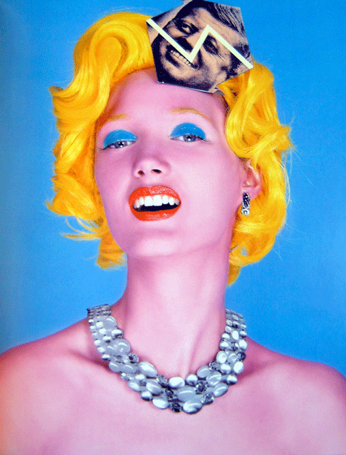
I believe there is no original or eventual
ending and that we merely change, ...
patriciamillar.blogspot.com

This piece illustrates an inventive adaptation of the famous Andy Warhol's 'Marilyn Monroe'. This bizarre life-like pop art has the same features as the original 'Marilyn' exhibiting eccentric blonde hair, pink face and bright blue eye shadow. These features commensurate with the
original image. However this image is unique with the inclusion of a torn picture of 'JFK ' who Marilyn had an alleged affair with. This is displayed on her forehead to illustrate, in an abstract way, how 'JFK' was always on her mind, or a part of her. This issue was very political and by illustrating 'JFK' in this way would display the affair he had the the icon 'Marilyn Monroe'.  This image would cause offence and outrage, disgracing the original piece by turning it into a political, adultery conspiracy.


Sunday 9 October 2011

Development of creative thought and structure

Managing a creative environment is very important for an artist/ designer. The surroundings where you work can instigate what inspires you when designing, from art work hanging on the wall, postcards, photos, to little pointless items you've collected over the years. All these can stimulate big ideas and even make you 'the designer' feel creative being surrounded by all this. Objects such as cameras and paint brushes can  help create a professional atmosphere, which can help encourage a professional approach and energise ideas, thus in tern, promoting professional work.  The objects you collect, even a toothbrush, could be useful; this could be used as a paint brush, All items collected, no matter how small, in your environment could be useful and everything can be used in an artistic way. " All children are artists. The problem is how to remain an artist once he grows up" Pablo Picassohttp://www.brainyquote.com/quotes/quotes/p/pablopicas169744.html . This quote can re-captures childhood and reminds you of when you collected those shells and pebbles off the beach.  Being surrounded by items you have collected can stimulate your creative side, encouraging and stimulating ideas


Designer Workspace
designerworkspace.tumblr.com
This workspace illustrates creativity, with loads of inspiration surrounding the designer. As you enter this room you are greeted by numerous magazine cuttings, postcards and photographs, together with a comfortable chair which will allow you to relax and let your mind go crazy. Shelves full of little items, toys etc. bring out the child within you (like from the Picasso quote). Bright colours from illustrations, photography, etc can help generate ideas while working. Appropriate surroundings can activate your mind and broaden imagination and ideas.  Rooms decorated in a light colour e.g white creates space and allows items to be prominent and instantly noticeable. When you enter a room appropriately furnished and decorated generates inspiration and enthusiasm to become creative.


My personal work environment demonstrates the theory of how collecting items and being surrounded by existing work can help stimulate you when you work. Here I have collected small personal items over a number of years, books, toys, etc. These items help  stimulate and broaden my ideas. I embrace ideas by considering all aspects of small individual items which can be utilised within my work. By being surrounded with graphics this energises and instigates ideas, contributing to the production of  creating unique work. Working in your own personal environment allows you to be comfortable with your surroundings and personal creative ideas.


Getting rid of assumptions when designing would help the public/ audience understand a message in a simpler, abstract and metaphoric way. The way you portray a message must be within the theme and purpose, but also designed in a interesting way and illustrate more possibilities of what the design is trying to depict. Rather than use the typical head line and photo, designers can make their designs more eye catching to the audience in a way that tells a story with imagination and creativity. Looking at a problem and solving it can make it more impressive and effective. Looking at things in a different perspective or angle could be the most effective part of the design, making it prominent and noticeable. This method can generate a strong, powerful message and capture the audiences immediate attention.

Brian Cronin illustrationmundo.com


Cronin's work is a perfect example of "getting rid of assumptions".  It illustrates
a story though a different approach. In this example Cronin demonstrates the American flag as a man eating monster, which would represents monstrosities within the American Government . The small individuals on the ground are the colours of the flag " Red and Blue" representing the 'people' of America. The 'Monster' is standing tall and powerful, observing the people of America, portraying the American Government as being totally in charge, This illustration is demonstrating the political side of America and portraying it in a domineering, powerful way. This image is created with traditional printing; by doing this, the Artist portrays his work extremely strong like traditional Japanese prints.

Brian Cronin
harmonikireland.com

This image illustrates Art Modernism, a Communist piece evidenced by the colours and the theme generated. The image portrays an army created from melted iron exhibiting them as "strong and tough'. However, if you look more closely, this could suggest the iron being fed to the men.  as food makes you big and strong. It helps you think of iron/metal by the red girder. The colour red could create a Russian theme, representing the Russian flag and the strong domineering army they possess. The limited colours use illustrates this poster in a clear, simple yet forceful way to capture interest.


Here is an example of my work using the above method, theory. The imagery I have used within my work portrays the lifestyle of cyber dating. The text, ripped pieces of paper, represents words 'texts/emails' that people use, rather than  there own personal voices. The use of "cut out eyes" emphasises that people do not really see the person when they cyber date, which is why I decided on the theme 'Love is Bind'. This collage successfully achieved a constructive, creative and easily recognisable piece of
work: simple yet effective.


Saturday 1 October 2011

Reflective visual journal

Utilising your creative Brain. The Brain is divided into two sections (Left/Right side) both sides of the brain are completely opposite. The Left side of the Brain acts more accurate, quantifying, clarifying, etc, knowing numbers and being more " realistic". The right side of the Brain acts more freely, playful, sensitive, curious, etc, acting as a child. Both sides of the Brain are amalgamated, combining both the thoughts; this is the main source exhibiting how artists combine ideas together with designs. Artists have fun being creative and adventurous with their work, being able to be experimental and wild  with their ideas (right side). However, these ideas are created with intention, purpose, direction and theme, etc which allow these ideas to be done with a meaning ( left side). Both sides of the Brain complement ideas and produce something amazing. This approach defines what a artist thinks and how ideas are distributed.


Artist Michelle Ward- book "Al.pha.bet.i.ca, an A-Z
creativity guide for collage and book artists"
- Lynne Perrella-page 47


Ward portrays the work with both right/left side of the brain by being "creative" with her journal, together as well as being sensible with the theme and style of the piece. Here we have an American 4th of July style journal page, with humorous pieces added. The denim pocket and the mini flags create a American patriotic 'diner' impression. However, this crazy layout is easily recognisable by its simplicity, making it easy to understand with its uncomplicated detail which can be immensely powerful at the same time. The add-on flaps generate a revealing side of the journal, utilising space to enhance ideas and make the design prominent and easily identifiable, being sensible and creative.


Artist Lesley Jacobs- book "Al.pha.bet.i.ca, an A-Z
creativity guide for collage and book artists"
-Lynne Perrella- page 37


Jacob's journal shares a theme of 'fish'. The double page spread explores the artist's favourite hobbies of fishing as well as being extremely decorative with cut-outs and prints, including her personal items, such as a photo.This funky design elaborates what she admires with her feelings towards her hobby. However, it is easily recognisable, showing both sides of the brain working together to bring a sensible, creative, bizarre format.This coincides with  bringing a little humour to the fish cut-outs in the bucket. The little insert attached is extremely effective, combining the theme with her childhood memories, which would have come from the left side of the brain; this also being portrayed with funky imagery surrounding it 'the right side of the brain'.

Friday 30 September 2011

Drawing by hand is a great way to record your thoughts and ideas. Rather than the typical cliche^ of writing them down, drawing can give more depth and illustrate a unique side of your ideas (being more free). Collaborating drawn ideas can create a 'URIKA' moment. Most ideas come through drawing as it gives a visual understanding . Drawing defines problems and this can be distributed as problem solving, which helps you nurture your ideas. How people distribute these thoughts and ideas are placed in a journal-like book. Ideas are portrayed with various tones of colours, materials, styles, inks etc to express research or experiments from ideas illustrated . The technique of drawing, rather than using a computer, is more praticical for recording your ideas immediately.  Computers can delay and restrict ideas as you cannot be completely creative with your recordings. Free-hand drawing can open your way of thinking and you can be more creative, ideas and thoughts are automaticaly drawn down and you can be as creative with them as much as you wish. The sky's the limit!

Artist Jeanne Minnix -book "Artists journals and
sketchbooks, exploring and creating personal pages"
-Lynee Perrella- page 21

This piece of work is a great example of recording ideas by using illustrations and samples of materials. In this journal the artist is expressing her ideas by using a mixture of colours which helps the artist to expresses her feelings. Some of the strongest points of the journal are brush strokes and the concept of collage, giving an indication of her ideas. This journal portrays vibrant colours which would indicate a celebration, festival, an adventurous scene of the journal.


Artist Billye Miraglia- book "Artists, journals and
sketchbooks, exploring and creating personal pages"
- Lynne Perrella-page 90


Miraglia's journal conveys a sunset/ sunrise approach, creating a warm, autumn like illusion. The images vissible illustrates plants which helps create the idea of " harvest".  The images of the plants are cut-outs and this demostrates how illustrations in exsisting magazines, photos, etc can help influence us in our designs. This is a great way to collaborate other ideas with your own. The right side of the journal portrays a gothic mediveal illustraion and photography. The images
portray an impression of 'halloween' which together with the 'harvest; theme are around the same period of the year, October/autumn.  This is successfully achieved with the use of the colour orange, reflecting falling leaves and pumpkins. The two pages compliment each other very well, especially with the use of rustic orange water colours, generating a well put together finished look.