Monday 7 November 2011

Influences and reactions

INTERPRETATION can induce many different perceptions, whether it is existing projects or themes. The interpretation can re-create concepts to fit appropriate time or place, but still capturing the original concept. Stories are a prime example of how interpretation can influence a re-adaptation.  Personal interpretation of what a story is trying to convey can change the meaning significantly, although sometimes this can be advantageous to accommodate appropriate audiences. The re-adaptations below have evolved through time portraying different interpretations, especially the perception of 'Peter Pan's' characteristic attributes.


Mabel Lucy Atwell -
Peter Pan sewing. at 6:00 AM.
Labels: Mabel Lucy Atwell
childillustration.blogspot.com
This first example of ' Peter Pan' is Wendy stitching Peter's shadow to his feet. This imagery derives from the original play in the early 1900s by J.M Barrie. Here the illustrator portrays Peter as a pixie by the clothes he wears, earthly colours used and rosy cheeks intimate eternal youth.. The small red shoes epitomises children's shoes, again giving Peter Pan that young, innocent youthful appearance. The colours in this picture are dull, and dismal, displaying only a small light from the candle which instantly symbolises night.  This is the time Peter lurks around to see if Wendy's brothers are asleep, portraying himself as a mischievous school boy, unethically entering a young girls room..This is one of the earliest illustrations of Peter Pan and Mabel Lucy's interpretation successfully captures the charming scene from the play.


Tags: Disney boy Peter Pan
boysofdisney.tumblr.com


Walt Disney's adaptation of J.M. Barrie's classic presents a clear distinct illustration, portraying Peter Pan with a greater exhilarating appearance. His appearance displays an image of a school boy playing around, similar to the original Atwell's version. This imagery has been adapted from Atwell's original version of Peter Pan's innocent, cute appearance, to portray a more modern image of an adventurous character. As a film version, imagery can be more concise and explicit to give the character a modern appearance. This has successfully been achieved, again with the use of earthly colours, sustaining the original illustrated child-like features.This modern version of Peter Pan was more appealing to the younger audience of the 50s.

 
A third feature-length adaptation,
2004's Peter Pan, ...
waterfrontvideoburl.blogspot.com

This dark, mysterious adaptation portrays a realistic, real life version of Peter Pan, while still capturing the classic illustration of a cute, innocent boy, evidenced by the boy's blond baby locks. This version exhibits Peter wearing tropical clothing, creating an impression it may be made from creeping ivy, but with a Tarzan, natural, primitive, wild child appearance. This captures how the real Peter Pan should be portrayed. From the original interpretation of Peter Pan to this recent version you can see how Peter has evolved to a darker and more adventures character. Peter Pan's character has successfully been adapted throughout the decades which has proven adaptations can be timeless and can continue so for decades to come.


Medium uses experiences to get work recognised.  This can be established through a variety of ways including design, creativity together with product and technical development.  It is about exhibiting your work and getting yourself  noticed in a positive way. Designers often use Agencies to promote their work, allowing clients to easily engage via the website. Posters and exhibitions are also an excellent way to get work and ideas positively recognised.

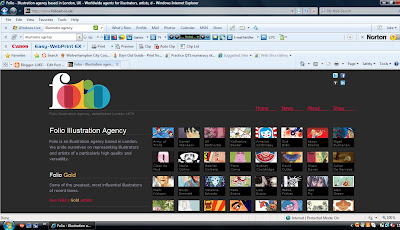
http://www.folioart.co.uk/
Folio is an example of how an Illustration agency specialises in promoting designers work. Designs are marketed in a distinctive way to make them invigorating and energize interest. Agency's exhibit a sample of individual artist's work on the website. They incorporate a sample of their work within a small box as a taster of the type of material achievable. By assessing this website, clients can instantly identify the quality of work and the type of design they are looking for.  This is more cost effective, as clients do not have to contact individual company's separately which could be very time consuming. Although all designers are competing for work, the variety of portfolios displayed accommodates a diverse market, allowing work to be distributed widely.   This is an excellent professional way for designers to advertise and promote work also give an indication of individual company's capabilities..


Allan McEvoy from Leven who is studying HND
 Graphic Design with his pretty ...
adamsmithcollege.ac.uk

 Exhibitions are an alternative approach to promote a designer's work. This is less commercial, but can be extremely beneficial as it allows clients to see actual work and capabilities of the designer. Work can be more abstract, adventurous and outstanding than portfolios on a website, as Illustration Agencies look for what they perceive will attract their clients interest. Exhibitions allow designers to engage with individual clients in person and even. eventually, often build up an excellent rapport with each other. This in turn, may lead to the designer gaining regular work.  As well as one to one contact with clients, ideas and suggestions can be exchanged. Even if commitments are not made on the day, business cards can be given for future contact. Exhibitions are an excellent way to promote yourself  and creatively display your work.  Agencies, although have a place in today's market, can be restrictive and lacks the personal touch. Sometimes clients may be disappointed as designs shown on the website may vary when actually seen.
Thursday 3 November 2011

legibility is an alignment, positioning graphic elements in an informal way until a clear effect has been established. It is extremely important for a designer to consider typographic clarity in order to create effective designs.  Headings are often the main focal point and, therefore, it is crucial for this to be legible to attract immediate attention.  Numerous factors need to be consider if you wish your design to be prominent. Colour can enhance a message. However, with the inclusion of low contrast this can produce completely the opposite effect and may generate loss of interest. The use of large bold headings usually creates instant legibility as this is easily recognisable. By researching your audience's aspirations you will be able to consider how format, size etc may affect the appeal of your design. Another feature is the inclusion of text over imagery which,  although can be different and a prominent legible feature, too much can make it hard to understand.


http://www.davidcarsondesign.com/2001/
This imagery was designed by David Carson, who is very famous for his designs in 'Ray Gun'. This is an excellent example of legibility with the arranging of text, colour, size of  typography and how the typography compliments the imagery.The text illustrates the word ' Surf in Rico 3.1' which is very bizarre with the positioning of the text, especially how the 'U' connects with the ' R' demonstrating a unique image.  Colours used generate interest and the use of three main colours, together with assorted text works well, allowing the design to be legible and readable.  The design would not generate this effect if one block colour had been used.  A very simple background with a small image of a surfer easily establishes the theme 'surfing' which also contributes to the legibility of the design. The text over the image has successfully worked as this is not congested. The final design is fresh, unique, eye catching and easily readable demonstrating a brilliant marketing concept.


icon magazine cover copy.jpg.
Cover of icon magazine.
blog.lib.umn.edu
'Icon' magazine illustrates text combined with a full image as the background. This example has bold black typography for the logo at the top which is prominent and eye-catching.The text 'The 20 essential young architects' is displayed in a hot pink highlighted boarder.  The hot pink boarder enables the text displayed to be legible while being abstract covering the face of the image. This generates interest and a desire to read to the magazine in order to find out who this person is. You can recognise the image is a male by the face, posture and the clothing he is wearing.  All these featured are legible to the public; they are clear, readable and unique in comparison to other magazines.. This magazine front cover generates an abstract approach, with the text providing an indication as to the contents of the magazine. The image may also represent 'eyes telling the story'. The logo 'Icon'  portrays the image of the man as an 'Icon' and people in this magazine are icons. However this man is such an icon his identity is hidden, A very abstract and eye catching design which makes the text clear and legible towards the audience.


Visual Hierarchy is organising your work to create a design with visible importance. This can be achieved through style, colour, contrast, size, position or shape. The theory of this design establishes why the designer needs to be unique to other designers.  Graphic design is very competitive and the same principles are used throughout the industry. It is extremely important, therefore, to give the main element of your design prominence in an effective way. The designer needs to consider all visual elements, deciding on what initially attractts your eye and from this decide on the arranging and positioning of this concept. This principle comcept allows you to illustrate even a simple design in an appealing and forceful way. If there was no visual hierarchy, designs would have no distinctive features and lack visual importance.


From: The October 2010 issue of Company Magazine.
 I like the design of this ...
ukjournalism.co.uk
 
An effective, yet bizarre design for a magazine.  It is, however extremely eye catching and dynamic with its 3D appearance. This design creates a spectacular impression of the 'Hulk'  emerging from the front cover of the magazine and instantly attains the audiences attention. The cover creates an impression of the Hulk being extremely strong and creating an illusion that he is reaching out to get you. This design works well with the theme, strength as the  'Hulk' character is instantly recognisable by his face and the colour green. The design portrays the 'Hulk's' strength with the illusion he is tearing through a brick wall. This simple design works well with the theme and is what makes this magazine unique from other magazines . This visual hierarchy concept works extremely well here with the positioning of the 3D imagery, colouring and size of text. This design would not work well with all magazines as an explicit theme is required to be able to successfully utilize 3D imagery.


30 Outstandingly
Creative Poster Designs
creativefan.com

This poster design is very simple, however, the typography heading generates appealing art work. The positioning of the text and colours selected make the design striking and prominent.  This unique design has been created to generate interest and get the audience to stop and look closer at the unusual  text.  What is it saying?   The paragraph to the right of the poster has small text, purposely to detract attention from the importance of the title. The colours used have successfully created an abstract design, together with a 3D illusion. The two over- typewritten words seem bizarre, but gets the audience stop and look in more depth as to what the design is portraying. The visual hierarchy concept has successfully been achieved here with the coloured large text against a plain white background being the most eye catching element of the poster.